So did all of these stores just put the City Connects on display before MLB even revealed them
kcoch5817
Really thought outside the box on these.
neverAcquiesce
We’ve reached the « why are we even doing this? » phase of city connect.
Jux_
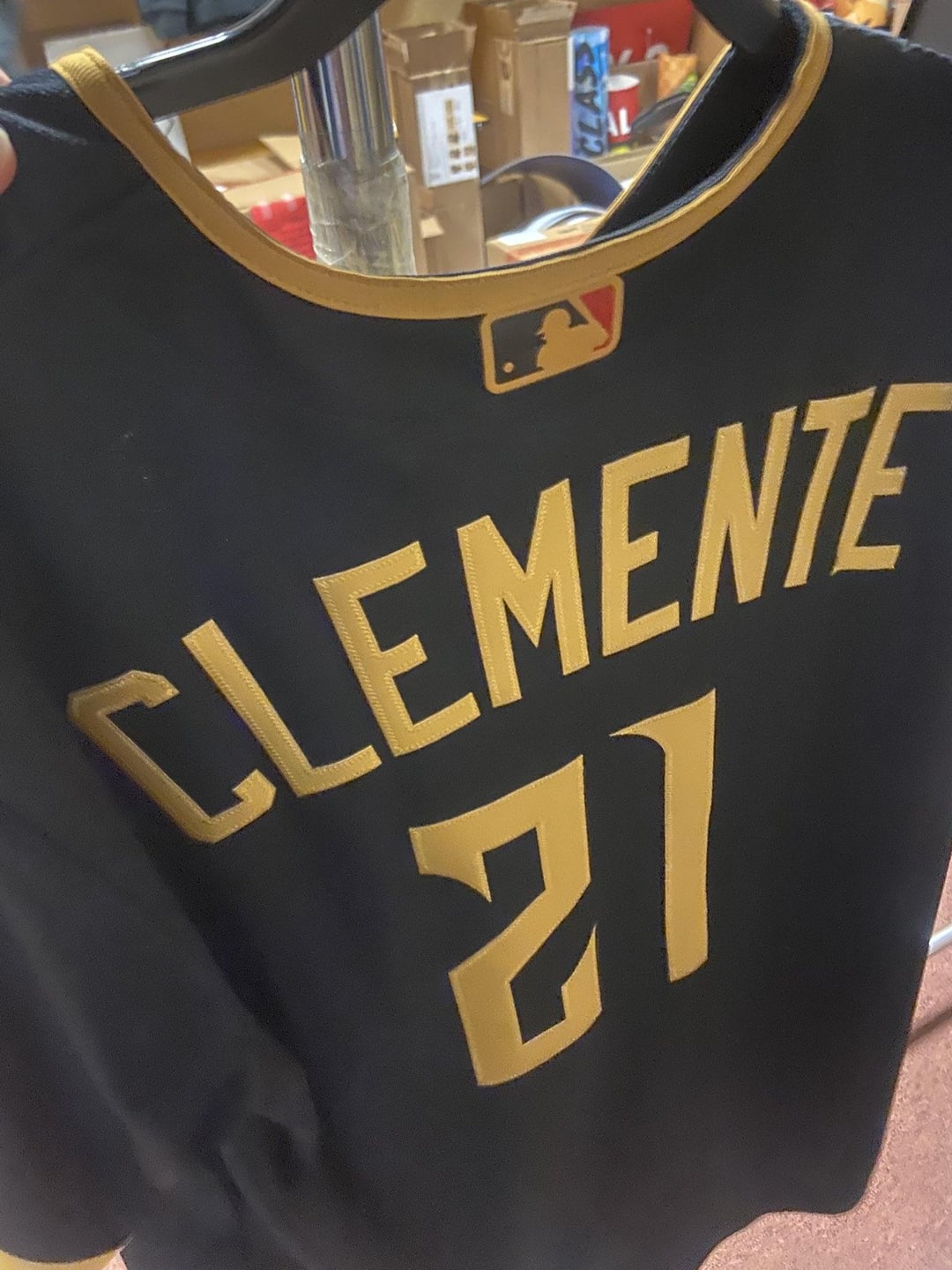
2001 MSWord font
Permaderps
Is someone sprinting around the fanatics warehouse before they get fired
Whiplash227
Hoist the cone
VientosEnthusiast
I didn’t even know they were one of the teams getting a new one
badonkagonk
The fact that so many city connects are being leaked at the same time is starting to get suspicious
my9rides5hotgun
Damn these are terrible.
Mew_111
I came in here to say how cool these look and everyone hates them lol
FitMongoose9

maybenextyearCLE
Not sure why the pirates need 3 separate black jerseys. At least their old city connect was yellow so it was kinda different
sloppyjo12
New city connects are the world’s worst kept secret this year
jmarinara
They suck, as usual. Because someone bought the rights to “Steel City” and MLB or whoever is in charge just won’t pay to use it. Some get a generic Pirates jersey which really makes one wonder why we even bother.
I am not all that into the city connectivity stuff anyway, I think most of it is kinda ugly, but it really doesn’t help that my team has the most generic and pointless version of them all.
DeepSpaceBoner
Fanatics quality no doubt… I’ll pass
Melodic_Swing8521
Straight ASS
scmjohns
“Leaked”
Runaway-Mango
Such poor quality.
Snoopytar
whats even the point of having this uniform? if I saw them wearing these id just assume they were the regular alternates. city connects should at least try something out of the box
ErniePottsShoelifts
Can we be done with City Connects already? This may be « old man yells at cloud » of me but you need a home, an away, and an alternate. Anything more is just a crowded, disjointed mess (except in this case since the Pirates have so many black jerseys).
It’s just a cash grab, for the worst sports merchandising company to ever exist mind you, with poorly executed alternates.
Gbrusse
It seems like for all of these city connect jerseys they gathered up all of the graphic designers who don’t like baseball and are not from these cities to design them.
I recall only the first Nationals CC actually being good.
Disused_Yeti
That’s gotta just be some random not on field jersey
aawagner011
Can someone please leak the Braves City Connect? I’m just hoping it’s not terrible 🤞
StigmataSatanas
Hey, this one is actually neat.
SLR107FR-31
Does anyone else just really really hate the name « City Connect »? Or am I just that one weirdo.
I like the jerseys!
Aggressive-Mix4971
Well that’s boring as hell.
Willywills1
Man they ain’t even trying anymore
scrambles57
Where are they?
Jumpy_Smoke_3757
Better than the current yellow ones. Still mad Skenes wore it on the cover of The Show
eggs_and_bacon
The thing with the city connect jerseys is that the city of Pittsburgh has a lot of iconic features with which they can, you know, Connect to the City, but they never do.
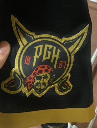
Beyond that, the Pirates have about 15 historic iterations of the logo that they could also incorporate into the main design, but they never do.
They keep settling for some “intro to graphic design” font library with a patch lazily slapped on the shoulder.
If the league is gonna continue doing this naked cash grab of “limited edition” merch with these jerseys every year, can we at least get something worth spending money on?
CraftingCalm
So in the past two days, we’ve gotten: San Diego, Baltimore, Texas, and Pittsburgh leaks. And they’ve all been incredibly bad. Baltimore’s is the least bad, but it’s still bad.
I thought CC unis were supposed to be bold, unique, fun, and out of the ordinary. These are all bland, boring, uninspired, mediocre, safe, and ordinary.


32 Comments
One of the jerseys of all time
So did all of these stores just put the City Connects on display before MLB even revealed them
Really thought outside the box on these.
We’ve reached the « why are we even doing this? » phase of city connect.
2001 MSWord font
Is someone sprinting around the fanatics warehouse before they get fired
Hoist the cone
I didn’t even know they were one of the teams getting a new one
The fact that so many city connects are being leaked at the same time is starting to get suspicious
Damn these are terrible.
I came in here to say how cool these look and everyone hates them lol

Not sure why the pirates need 3 separate black jerseys. At least their old city connect was yellow so it was kinda different
New city connects are the world’s worst kept secret this year
They suck, as usual. Because someone bought the rights to “Steel City” and MLB or whoever is in charge just won’t pay to use it. Some get a generic Pirates jersey which really makes one wonder why we even bother.
I am not all that into the city connectivity stuff anyway, I think most of it is kinda ugly, but it really doesn’t help that my team has the most generic and pointless version of them all.
Fanatics quality no doubt… I’ll pass
Straight ASS
“Leaked”
Such poor quality.
whats even the point of having this uniform? if I saw them wearing these id just assume they were the regular alternates. city connects should at least try something out of the box
Can we be done with City Connects already? This may be « old man yells at cloud » of me but you need a home, an away, and an alternate. Anything more is just a crowded, disjointed mess (except in this case since the Pirates have so many black jerseys).
It’s just a cash grab, for the worst sports merchandising company to ever exist mind you, with poorly executed alternates.
It seems like for all of these city connect jerseys they gathered up all of the graphic designers who don’t like baseball and are not from these cities to design them.
I recall only the first Nationals CC actually being good.
That’s gotta just be some random not on field jersey
Can someone please leak the Braves City Connect? I’m just hoping it’s not terrible 🤞
Hey, this one is actually neat.
Does anyone else just really really hate the name « City Connect »? Or am I just that one weirdo.
I like the jerseys!
Well that’s boring as hell.
Man they ain’t even trying anymore
Where are they?
Better than the current yellow ones. Still mad Skenes wore it on the cover of The Show
The thing with the city connect jerseys is that the city of Pittsburgh has a lot of iconic features with which they can, you know, Connect to the City, but they never do.
Beyond that, the Pirates have about 15 historic iterations of the logo that they could also incorporate into the main design, but they never do.
They keep settling for some “intro to graphic design” font library with a patch lazily slapped on the shoulder.
If the league is gonna continue doing this naked cash grab of “limited edition” merch with these jerseys every year, can we at least get something worth spending money on?
So in the past two days, we’ve gotten: San Diego, Baltimore, Texas, and Pittsburgh leaks. And they’ve all been incredibly bad. Baltimore’s is the least bad, but it’s still bad.
I thought CC unis were supposed to be bold, unique, fun, and out of the ordinary. These are all bland, boring, uninspired, mediocre, safe, and ordinary.
What’s even the point?