Terrible. It’s so big and still makes everything so small.
Duudze
Vile 😵💫
iiKrOna
Is the
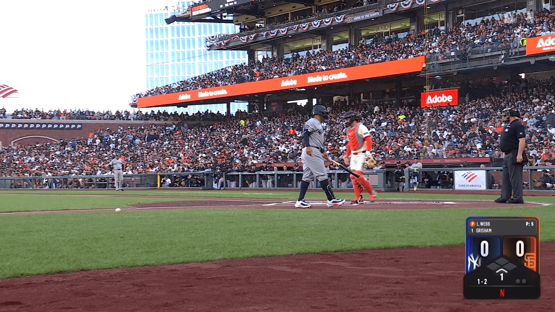
“Pitcher Pitch Count
Batter”
Supposed to be like an iPhone notification?
bruvmode
Garbage
wako944
It’s hideous
Apollodx
It’s too big and too small at the same time
Jonjon428
It’s like if Apple’s UI had a horrific merge with the New York Subway System
labonart
Negative: font size way too small, ugly, missing info
Positive: as long as nobody scores it looks like a face 0^0 (and if there’s a guy on second, it gets a nose!)
Bubblesheep
0 0
︿
PetrificusSomewhatus
It is trying way too hard
HunterMysterious8324
That’s a choice. I don’t think it’s the right one.
MegaSportsFan
How about no…
hawksku999
Garbage
LukaDoncicIsObese
Trash
DA_87
It looks squished.
JorSimpson45
Looks like the MLB app widget on iPhone lol
Enough-Ad-3111
All that for two games and the Home Run Derby?
Dang.
RedfishRanger
The font size!
YoshiNumber1
Good god that is awful
SeaDisk6699
Need a magnifying glass just to see the count and outs
No-Mall7061
Who’s also getting a crap pixelated picture?! Netflix can’t handle the traffic once again!!!
SurpriseStandard3258
It’s so damn hard to read the names
sdrj77
It’s fine. Gives all the info you might care about in the moment.
It’s designed for a full size TV, though.
Someone will resize the text eventually for other devices.
After-Antelope-8636
Was coming here to say this
brycats
Worse than ESPN? Didn’t think it was possible.
Consanit
What a strange and ugly design
rabidantidentyte

KingChez30
Looks like a mlb the show scorebug but for ants
ATG915
Looks like dookie. Hard as hell to read the names and pitch count at the top
Eagle7546_
So is the huge dead space at the bottom just so they could have the Netflix logo at a certain size because if they shrunk the bottom and just made the top bigger it would be a fun scorebug
skoobydoodoo
Someone approved this
mustang6172
Why did everyone agree that the count should be numeric but the outs non-numeric?
MuscularSturgeon
Looks like it was an accident
ElBrooce
I can’t fucking read the pitcher/batter names. Jeezus, so many fails here Netflix
bd1047
What a disaster of a broadcast so far
Cpov1
The aspect ratio seems…off
BatmansPussy
This green screen shit for ads needs to go ASAP!
AMCDaddy
Did they release the whole season so I can binge watch this weekend?

44 Comments
no.
My god it’s ugly
ew
What is the text size – a scorebug for ants?

Can’t even read the names on tablet view.
Terrible. It’s so big and still makes everything so small.
Vile 😵💫
Is the
“Pitcher Pitch Count
Batter”
Supposed to be like an iPhone notification?
Garbage
It’s hideous
It’s too big and too small at the same time
It’s like if Apple’s UI had a horrific merge with the New York Subway System
Negative: font size way too small, ugly, missing info
Positive: as long as nobody scores it looks like a face 0^0 (and if there’s a guy on second, it gets a nose!)
0 0
︿
It is trying way too hard
That’s a choice. I don’t think it’s the right one.
How about no…
Garbage
Trash
It looks squished.
Looks like the MLB app widget on iPhone lol
All that for two games and the Home Run Derby?
Dang.
The font size!
Good god that is awful
Need a magnifying glass just to see the count and outs
Who’s also getting a crap pixelated picture?! Netflix can’t handle the traffic once again!!!
It’s so damn hard to read the names
It’s fine. Gives all the info you might care about in the moment.
It’s designed for a full size TV, though.
Someone will resize the text eventually for other devices.
Was coming here to say this
Worse than ESPN? Didn’t think it was possible.
What a strange and ugly design

Looks like a mlb the show scorebug but for ants
Looks like dookie. Hard as hell to read the names and pitch count at the top
So is the huge dead space at the bottom just so they could have the Netflix logo at a certain size because if they shrunk the bottom and just made the top bigger it would be a fun scorebug
Someone approved this
Why did everyone agree that the count should be numeric but the outs non-numeric?
Looks like it was an accident
I can’t fucking read the pitcher/batter names. Jeezus, so many fails here Netflix
What a disaster of a broadcast so far
The aspect ratio seems…off
This green screen shit for ads needs to go ASAP!
Did they release the whole season so I can binge watch this weekend?