Also pictured here is the MASN scorebug during the 3rd inning yesterday when it just disappeared for no reason
neverAcquiesce
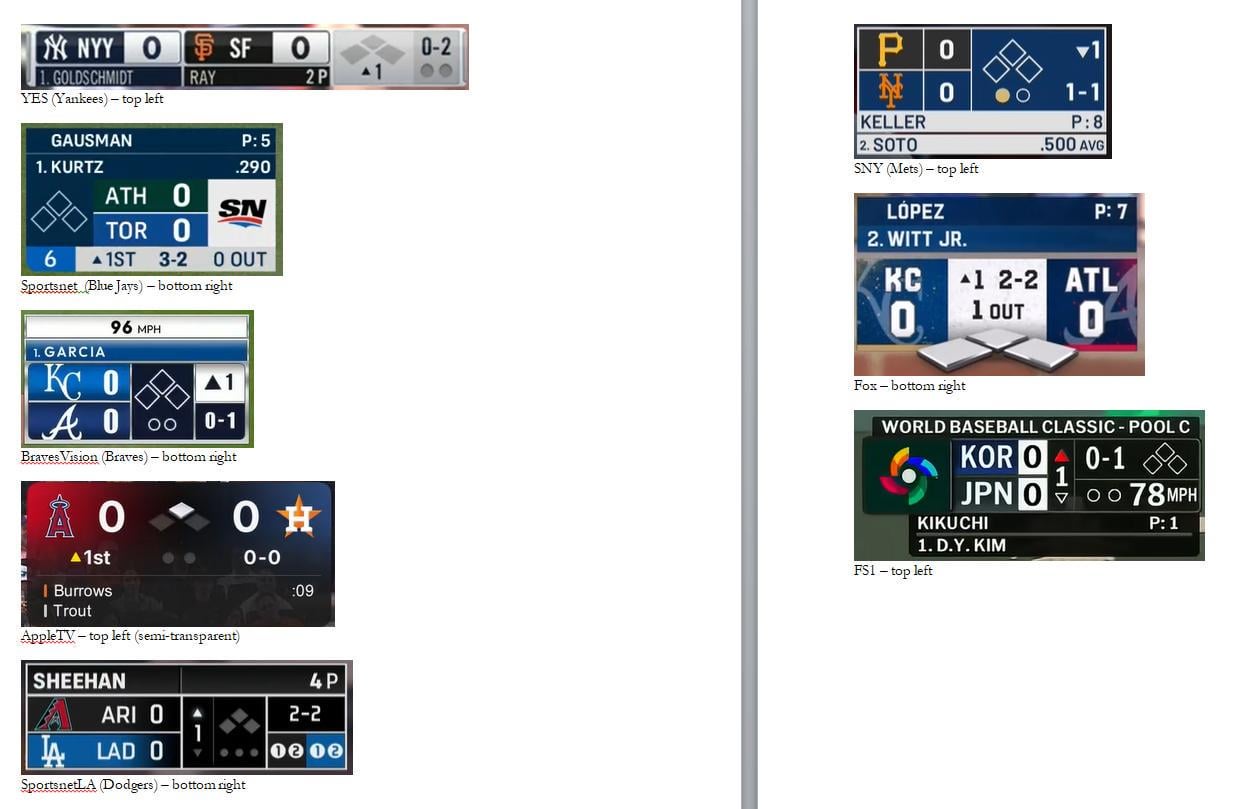
This finishes off the team-specific scorebugs, and grabs everything with the exception of TBS and ESPN which we’ll see later in the year. I grabbed the FS1 WBC bug, presuming it will stay the same.
MLB-produced redundancies are left off again, as are the A’s and Giants for sharing NBC templates with the previously-posted Phillies, and ditto Pirates for using the same as the Red Sox.
The_Jackoooist
I like the Sportsnet one, it’s compact, simple and highlights the key elements succinctly without taking up too much of the screen.
baseballviper04
No bias at all, I’ve always preferred the Yankees scorebugs
oogieball
SNY is so small and clean.
Real_Statistician538
SNY is probably my favorite by a long shot.
Low-Hovercraft-8791
I don’t need a constant awareness of how many challenges my team has available. The information is only relevant on relatively rare, one-off basis. It should not be part of a scorebug.
The Mets scorebug is the best in my opinion. I like how it gives the batter’s current average. It’s strange that the Dodgers one doesn’t mention the batter at all.
Jux_
The SNLA has been bugging me, they don’t show any hitter info until the second time through the lineup. Would at least be helpful to know where in the lineup they are.
bicyclemom
Now show them with player names that have diacriticals. I recall the Mets one had a problem with the spacing on the top, noticeable for players like Dedniel Núñez. Otherwise I really like the Mets one. I also like Toronto’s.
cheersfan100
Yes/yankees having the player below their team is actually really helpful if you’re just a casual viewer
krizzlybear
Sportsnet is almost my perfect preference, I just want inning/outs/count to be part of the bases indicator instead of the SN logo.
OGBRedditThrowaway
I really don’t like the Astros one this year. The batter display barely worked the entire Angels series and it’s just a hodgepodge of styles. The pop-ups graphics are still from the last design, and the mid-inning display.
It just feels like Crane and Fertita gave them zero budget to actually properly overhaul the graphics and comes through looking half-assed.
Equivalent_Waltz8890
The dodger one not having the player up to bat on it is weird. Also I never liked how the Bluejays one has the big SN taking up a third of the bug
pilotharrison
However, the best scorebug ever is still the P00P one.
cogginsmatt
I’m going to say something controversial – I think if you’re going to use blips to indicate outs, there should be three.
iveo83
I HATE when they don’t have the batting order. Most of them do but why would you not?
irishthunder222
I actually like Apple TV one. Modern and clean
MrLuckyTimeOW
My only issue with the Sportsnet score bug is the fact that their logo takes up a good percentage of it. They should remove it and add in the ABS Challenges remaining for both teams.
Satansleadguitarist
Being a Jays fan I’m partial to the Sportsnet one, but the SNY one honestly looks like a better designed version of it. It’s nice not having the SN logo taking up so much space for no reason.
PalmettoBugg005
The Braves one is a huge improvement over the Bally one that took up the entire bottom of the screen. It was a little strange that they did blue and blue, though.
R62AGUY
Mets best one
Appropriate_Bar_3113
Mets and Jays are clean and functional.
I have never liked a score bug in any sport where the teams are side by side with the numbers far apart. Stacked above each other is more effective.
sweet-like-justice
AppleTV is good but need to bold/increase font size. My vote goes to SNY – simple/straightforward.
Fox is bad – Netflix is terrible.
Electronic-Jaguar461
I wish more scorebugs would move to the numbered out count. It’s annoying to have to explain to friends and family what the dots are when they blend in so much and look like decor. Mix Yankees with Jays and it’s perfect.
Also what’s up with FOX and these Fortnite looking, big ahh scorebugs. It’s not as bad as the NFL scorebug but damn it’s loud.
socool111
Am i the only one that things all of them are fine, as long as they dont include ads?
There hasnt be egregiously bad (that i’ve seen) other than recent ad placements.
IAmBecomeTeemo
Obviously I’m biased, but I think that the YES bug is fantastic. It makes efficient use of space, and having the pitcher and batter directly below their team reduces confusion. Showing batting order position at all times is helpful. Plus, not seen here, is that it will show what the hitter had done in previous PAs the second+ time through. So like, 0-1, or 2 BB, etc. It’s probably the most information-dense of the bugs without looking cluttered or disjointed.

26 Comments
Also pictured here is the MASN scorebug during the 3rd inning yesterday when it just disappeared for no reason
This finishes off the team-specific scorebugs, and grabs everything with the exception of TBS and ESPN which we’ll see later in the year. I grabbed the FS1 WBC bug, presuming it will stay the same.
MLB-produced redundancies are left off again, as are the A’s and Giants for sharing NBC templates with the previously-posted Phillies, and ditto Pirates for using the same as the Red Sox.
I like the Sportsnet one, it’s compact, simple and highlights the key elements succinctly without taking up too much of the screen.
No bias at all, I’ve always preferred the Yankees scorebugs
SNY is so small and clean.
SNY is probably my favorite by a long shot.
I don’t need a constant awareness of how many challenges my team has available. The information is only relevant on relatively rare, one-off basis. It should not be part of a scorebug.
The Mets scorebug is the best in my opinion. I like how it gives the batter’s current average. It’s strange that the Dodgers one doesn’t mention the batter at all.
The SNLA has been bugging me, they don’t show any hitter info until the second time through the lineup. Would at least be helpful to know where in the lineup they are.
Now show them with player names that have diacriticals. I recall the Mets one had a problem with the spacing on the top, noticeable for players like Dedniel Núñez. Otherwise I really like the Mets one. I also like Toronto’s.
Yes/yankees having the player below their team is actually really helpful if you’re just a casual viewer
Sportsnet is almost my perfect preference, I just want inning/outs/count to be part of the bases indicator instead of the SN logo.
I really don’t like the Astros one this year. The batter display barely worked the entire Angels series and it’s just a hodgepodge of styles. The pop-ups graphics are still from the last design, and the mid-inning display.
It just feels like Crane and Fertita gave them zero budget to actually properly overhaul the graphics and comes through looking half-assed.
The dodger one not having the player up to bat on it is weird. Also I never liked how the Bluejays one has the big SN taking up a third of the bug
However, the best scorebug ever is still the P00P one.
I’m going to say something controversial – I think if you’re going to use blips to indicate outs, there should be three.
I HATE when they don’t have the batting order. Most of them do but why would you not?
I actually like Apple TV one. Modern and clean
My only issue with the Sportsnet score bug is the fact that their logo takes up a good percentage of it. They should remove it and add in the ABS Challenges remaining for both teams.
Being a Jays fan I’m partial to the Sportsnet one, but the SNY one honestly looks like a better designed version of it. It’s nice not having the SN logo taking up so much space for no reason.
The Braves one is a huge improvement over the Bally one that took up the entire bottom of the screen. It was a little strange that they did blue and blue, though.
Mets best one
Mets and Jays are clean and functional.
I have never liked a score bug in any sport where the teams are side by side with the numbers far apart. Stacked above each other is more effective.
AppleTV is good but need to bold/increase font size. My vote goes to SNY – simple/straightforward.
Fox is bad – Netflix is terrible.
I wish more scorebugs would move to the numbered out count. It’s annoying to have to explain to friends and family what the dots are when they blend in so much and look like decor. Mix Yankees with Jays and it’s perfect.
Also what’s up with FOX and these Fortnite looking, big ahh scorebugs. It’s not as bad as the NFL scorebug but damn it’s loud.
Am i the only one that things all of them are fine, as long as they dont include ads?
There hasnt be egregiously bad (that i’ve seen) other than recent ad placements.
Obviously I’m biased, but I think that the YES bug is fantastic. It makes efficient use of space, and having the pitcher and batter directly below their team reduces confusion. Showing batting order position at all times is helpful. Plus, not seen here, is that it will show what the hitter had done in previous PAs the second+ time through. So like, 0-1, or 2 BB, etc. It’s probably the most information-dense of the bugs without looking cluttered or disjointed.