Some graphic designer was paid six figures for this
PorkinsHeldIt
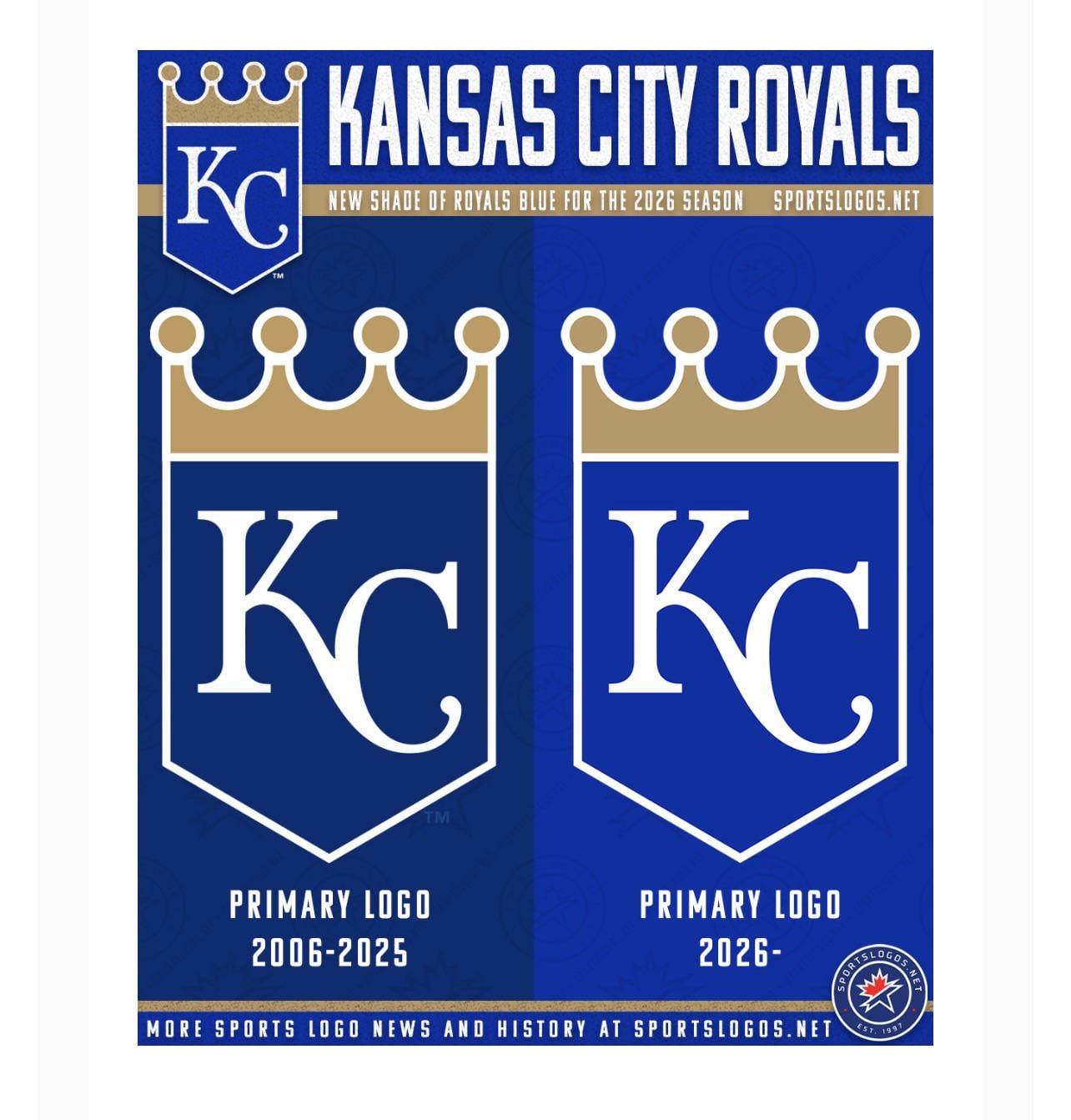
it seems like a miniscule change but I actually like the new shade of blue a lot more
RumbleTheCassette
I can no longer support this team I don’t even recognize them anymore.
jayhawk8
Outraged.
Aggressive-Hawk9186
It changes it all! A revolution in Kansas
sawkandthrohaway
I feel like every team is finally moving away from the muted colors of the late 90s/early 2000s
Disused_Yeti
royal blue lite
notnef51

Pittsburghsports2006
japan flag 1999
RichAbbreviations966
Contraction
7LineArmy
That is fucking bold. Idk how the fanbase is going to react, risky move.
Ill_Pressure3893
They changed the color to … royal blue?
Game_boy_98

Admirable_Outcome932
In 1999, Japan redesigned its flag
StrigiStockBacking
The one on the left is navy blue, the one on the right is definitely royal blue, so does this mean they’re also going to drop their official name, the Kansas City Navy Blues?
Nitarinminister
Slow tf down KC
gougarbabes
Colorblind people won’t even know the difference
SaulGibson
Does the K look a little bigger?
archasaurus
Based change to royal blue
thatguygreg
It looks like they cleaned off decades of car exhaust residue
8lackl1ght

bejahu
All things considered, the new blue is better.
Pitiful_Win_9110
In 2021, Xiaomi redesigned its logo
Mozilla_Fennekin
technically incorrect as the Royals changed their logo in 2019. It used to be the shield along with the Royals name below it, now it’s just the shield.
spazz720
They’re fucking trolling aren’t they?
wood_you_believe
What’s the hex on that
Calm_Tonight_9277
Looks like Navy —> Royal
Boulderdorf
A toothpick changes everything
GotMoFans
From royal blue to jester blue?
Decent-Lawfulness-71
This is a big problem
saint_elmo_of_seseme
Trash. Unusable. Go back to the drawing board.
Any-Exam8504
New Holland tractors 🤝 Kansas City Royals change the shade of blue
Historical-Truck-948
The Royals went back royal blue. Imagine that
melt11
Seems like that’s what it should be
cowboy_catolico
Just copying that dodger blue it looks like
JorSimpson45
Genuinely what is the point of changing the color shade for a logo? After 20 years someone in the Royals org jus suddenly decided “too dark”

46 Comments
I don’t even recognize the new logo
What a bold change

In 1999, Japan redesigned its flag
Some graphic designer was paid six figures for this
it seems like a miniscule change but I actually like the new shade of blue a lot more
I can no longer support this team I don’t even recognize them anymore.
Outraged.
It changes it all! A revolution in Kansas
I feel like every team is finally moving away from the muted colors of the late 90s/early 2000s
royal blue lite

japan flag 1999
Contraction
That is fucking bold. Idk how the fanbase is going to react, risky move.
They changed the color to … royal blue?

In 1999, Japan redesigned its flag
The one on the left is navy blue, the one on the right is definitely royal blue, so does this mean they’re also going to drop their official name, the Kansas City Navy Blues?
Slow tf down KC
Colorblind people won’t even know the difference
Does the K look a little bigger?
Based change to royal blue
It looks like they cleaned off decades of car exhaust residue

All things considered, the new blue is better.
In 2021, Xiaomi redesigned its logo
technically incorrect as the Royals changed their logo in 2019. It used to be the shield along with the Royals name below it, now it’s just the shield.
They’re fucking trolling aren’t they?
What’s the hex on that
Looks like Navy —> Royal
A toothpick changes everything
From royal blue to jester blue?
This is a big problem
Trash. Unusable. Go back to the drawing board.
New Holland tractors 🤝 Kansas City Royals change the shade of blue
The Royals went back royal blue. Imagine that
Seems like that’s what it should be
Just copying that dodger blue it looks like
Genuinely what is the point of changing the color shade for a logo? After 20 years someone in the Royals org jus suddenly decided “too dark”
should’ve made the crown darker though

ROYAL BLUE IS BACK
Too radical!

