I was lucky enough to get the previous City Connect jersey before they started adding the Quikrete patches. A shame that won’t be possible this time.
ExpirjTec
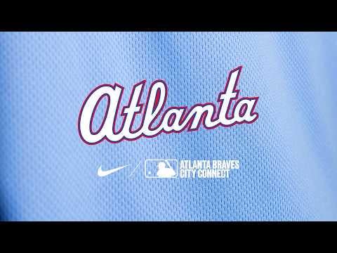
that powder blue is cleaaaaan
neverAcquiesce
YOU WILL NEVER STOP BUYING
Wandering_Mallard
I like these a lot better than the last ones. It’s still super lame that they’re just modifying throwbacks instead of making an attempt to, you know, connect to the city
ISurvivedTheJaunt
YOU GET POWDER BLUE! AND YOU GET POWDER BLUE! EVERYBODY GETS POWDER BLUE!!!!!
enkayfour
Not normally a fan of powder/baby blue, but these might be the nicest connects so far.
UniqueEditor8372
Never loved how casual a lowercase logo looks but overall these are pretty clean. Feels like Nike is playing it safe with this new wave after all the backlash.
Deep-Gain5289
Hurdled that low bar. Barely, but made it.
Incredibly low.
Rhyno18
I like ’em, but I’m a sucker for throwbacks anyway, and I grew up watching everyone wear powder blue so it takes me back
eekbarbaderkle
They look nice, but powder blue has been done so many times by so many teams that it’s starting to feel a little underwhelming. Even though it always looks nice.
Zoolanderek
When do they cut the shit and just start calling these alternates
InvasionXX
Love the TBS sleeve. This looks like the best CC this year.
Kakali4
This the first MLB hat to have piping on the lid?
JoelsCaddy
Another throwback?
Disused_Yeti
that’s just a fauxback
not even trying at this point
TemoSahn
Let’s hope Sale doesn’t cut these up with scissors
glassesandabeard
This is the perfect jersey in my opinion. Baby blue on white pants, pullover style jersey.
Jays fan, but drew up watching TBS and the Braves, will snag one of these!
batmansubzero
Why does powder blue connect to every city..?
Smallville_K
Should have released these on 6.05 ⏰
the47thman
Pretty tame/inoffensive. I do enjoy the subtle self-own of “we made the team super-accessible to follow and that made them popular, please enjoy signing up to a half-dozen streaming services to watch this season’s games.”
HairHelp4363
Oh riveting yet another powder blue jersey
Historical-Truck-948
Every club will have a baby blue uniform soon
HuckleberryAny4541
Yawn
Internal_Wheel_89
these look great. We need more pullovers in general.
salvagedstarstuff
I do love a lowercase font!! I also find it particularly ironic and bleak that the braves are who had the huge network coverage of the southeast which was and is home to many diverse indigenous nations, and now the name and the phrase braves country directly ignores
cackalackattack
Clean. Judging by the leaks these are the best Connects by a wide margin.
JohnnyMulan
Out with old and in with the new. City connect 1 and City Connect 2. Which is wild.
I wonder will every team get new ones or are we seeing just these handful of teams with these leaks
leftfieldlongball
Chris Sale not looking happy about those sleeves.
trickman01
Nice alternate. Not a great city connect.
Growly150
Why is this the new color scheme for every team? Houston Cougars, Tennessee Titans and Atlanta Braves all baby blue and red.
SomethingCreative13
I was critical of our previous City Connects for feeling like our throwbacks but worse. I actually like these though. Yeah they’re throwback inspired, but they do enough different that they feel fresh for me. White lettering with the red added in along with the predominantly powder cap allow them to separate from just being throwbacks while still having the retro tie-in. Our previous ones were « What if we do the 70s uniforms but worse? » These feel inspired by the 80s but still do their own thing.
Therealdennissherry
Missed opportunity to make Magic City city connect a reality
wh_atever
Stylistically I actually love these, but there’s nothing city-connected to be found here
Quartznonyx
Theyre so boring and safe
halfhere
I’ve been hoping for Dale Murphy-era pullover blues for so long. Thank the sweet baby Jesus.

36 Comments
I was lucky enough to get the previous City Connect jersey before they started adding the Quikrete patches. A shame that won’t be possible this time.
that powder blue is cleaaaaan
YOU WILL NEVER STOP BUYING
I like these a lot better than the last ones. It’s still super lame that they’re just modifying throwbacks instead of making an attempt to, you know, connect to the city
YOU GET POWDER BLUE! AND YOU GET POWDER BLUE! EVERYBODY GETS POWDER BLUE!!!!!
Not normally a fan of powder/baby blue, but these might be the nicest connects so far.
Never loved how casual a lowercase logo looks but overall these are pretty clean. Feels like Nike is playing it safe with this new wave after all the backlash.
Hurdled that low bar. Barely, but made it.
Incredibly low.
I like ’em, but I’m a sucker for throwbacks anyway, and I grew up watching everyone wear powder blue so it takes me back
They look nice, but powder blue has been done so many times by so many teams that it’s starting to feel a little underwhelming. Even though it always looks nice.
When do they cut the shit and just start calling these alternates
Love the TBS sleeve. This looks like the best CC this year.
This the first MLB hat to have piping on the lid?
Another throwback?
that’s just a fauxback
not even trying at this point
Let’s hope Sale doesn’t cut these up with scissors
This is the perfect jersey in my opinion. Baby blue on white pants, pullover style jersey.
Jays fan, but drew up watching TBS and the Braves, will snag one of these!
Why does powder blue connect to every city..?
Should have released these on 6.05 ⏰
Pretty tame/inoffensive. I do enjoy the subtle self-own of “we made the team super-accessible to follow and that made them popular, please enjoy signing up to a half-dozen streaming services to watch this season’s games.”
Oh riveting yet another powder blue jersey
Every club will have a baby blue uniform soon
Yawn
these look great. We need more pullovers in general.
I do love a lowercase font!! I also find it particularly ironic and bleak that the braves are who had the huge network coverage of the southeast which was and is home to many diverse indigenous nations, and now the name and the phrase braves country directly ignores
Clean. Judging by the leaks these are the best Connects by a wide margin.
Out with old and in with the new. City connect 1 and City Connect 2. Which is wild.
I wonder will every team get new ones or are we seeing just these handful of teams with these leaks
Chris Sale not looking happy about those sleeves.
Nice alternate. Not a great city connect.
Why is this the new color scheme for every team? Houston Cougars, Tennessee Titans and Atlanta Braves all baby blue and red.
I was critical of our previous City Connects for feeling like our throwbacks but worse. I actually like these though. Yeah they’re throwback inspired, but they do enough different that they feel fresh for me. White lettering with the red added in along with the predominantly powder cap allow them to separate from just being throwbacks while still having the retro tie-in. Our previous ones were « What if we do the 70s uniforms but worse? » These feel inspired by the 80s but still do their own thing.
Missed opportunity to make Magic City city connect a reality
Stylistically I actually love these, but there’s nothing city-connected to be found here
Theyre so boring and safe
I’ve been hoping for Dale Murphy-era pullover blues for so long. Thank the sweet baby Jesus.
Powder blues always look so good