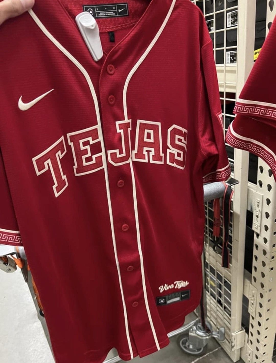
Using the Step Fret pattern this soon after the Gigantes uniforms were unveiled feels like unfortunate timing on their part
Do they go full BIG RED with pants too? Would be another Texas homage lol
neverAcquiesce
I can hear the clink of aluminum bat when I see this.
InformalInsurance455
Controversial for that roster huh
Disused_Yeti
it’s no tetas
Aggravating_Rise_179
Well this wont sit well with a certain group of voters
DebatableTheory
WHAT DID THEY DO TO MAH RANGERS UNIFORMS?
Jonjon428
Brandon Nimmo just fell to his knees
Redbubble89
I don’t like it. Belongs in AA where they try to get fans in but too beer league for the major league team
Single_Seesaw_9499
Very bland
GetBent009
looks incredibly boring tbh
nomoregroundhogs
I used to like how the Rangers would mix and match with the red and blue jerseys and caps. Then they stopped when they revised the uniform set a few years ago and I wished they’d bring red back.
Be careful what you wish for, I guess.
bs_hoffman
This feel so uninspired. Take away the « tejas » and what even is left? Some cool design on the sleeves. Shame to call this a City connect. I don’t even associate Red with the DFW area.
Di5pel
People think this is too boring but I personally feel like most of the city connect series are way over-designed, and kind of like this more simple approach.
Hour-Ad-9508
City connects were a mistake
Arkham_Z
Ok this is the first one in a while that just isn’t good. This looks like a little league jersey + sleeve design
1990Buscemi
At least they didn’t put El in front of the Rangers jersey like another sports team would have done with their alternates.
mattcojo2
Looks very similar to the very last Arizona coyotes alternate, with the sleeve pattern.
Soft_Cellist2141
Very boring, and the only thing that can even be considered a design element (the pattern on the sleeve cuffs) is lifted straight from the new Gigantes jerseys.
AlphaBern0
Looks like a red team mexico jersey without the green.
lazymonk68
Surely not. That’s the most phoned in city connect I’ve seen if so
Bootleschloogen
I don’t hate it but its rather boring. I like the design on the sleeve, but that doesn’t really speak Dallas/FtWorth to me
kbsick
Design could not be more lazy
Boom-Doc-a-Locka
Somehow this bland, uninspired design will be a HUGE talking point for a lot of Rangers fans.
forgivemeisuck
Translating to Spanish is a uniform hack.
Blitzdog416
wear that, and get deported. guarantee
Imaginary-Dot5387
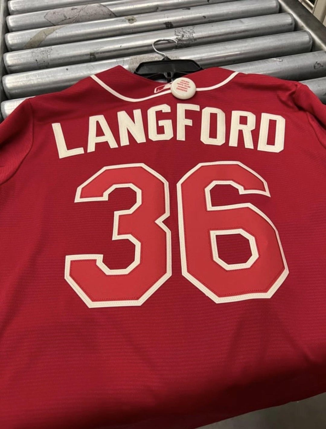
Red on red is brutal.
MFour_Sherman
The one they’ve had the last 3 seasons was awesome. This one sucks
naranjitayyo
Guys named Tejas won today
StyrofoamCueball
This looks like something you would buy at a truck stop.
michaeldanger19
wonder if the T striping is a reference to the old 1980s cap logo? Ether way i’m getting big college baseball vibes

30 Comments
Using the Step Fret pattern this soon after the Gigantes uniforms were unveiled feels like unfortunate timing on their part
Do they go full BIG RED with pants too? Would be another Texas homage lol
I can hear the clink of aluminum bat when I see this.
Controversial for that roster huh
it’s no tetas
Well this wont sit well with a certain group of voters
WHAT DID THEY DO TO MAH RANGERS UNIFORMS?
Brandon Nimmo just fell to his knees
I don’t like it. Belongs in AA where they try to get fans in but too beer league for the major league team
Very bland
looks incredibly boring tbh
I used to like how the Rangers would mix and match with the red and blue jerseys and caps. Then they stopped when they revised the uniform set a few years ago and I wished they’d bring red back.
Be careful what you wish for, I guess.
This feel so uninspired. Take away the « tejas » and what even is left? Some cool design on the sleeves. Shame to call this a City connect. I don’t even associate Red with the DFW area.
People think this is too boring but I personally feel like most of the city connect series are way over-designed, and kind of like this more simple approach.
City connects were a mistake
Ok this is the first one in a while that just isn’t good. This looks like a little league jersey + sleeve design
At least they didn’t put El in front of the Rangers jersey like another sports team would have done with their alternates.
Looks very similar to the very last Arizona coyotes alternate, with the sleeve pattern.
Very boring, and the only thing that can even be considered a design element (the pattern on the sleeve cuffs) is lifted straight from the new Gigantes jerseys.
Looks like a red team mexico jersey without the green.
Surely not. That’s the most phoned in city connect I’ve seen if so
I don’t hate it but its rather boring. I like the design on the sleeve, but that doesn’t really speak Dallas/FtWorth to me
Design could not be more lazy
Somehow this bland, uninspired design will be a HUGE talking point for a lot of Rangers fans.
Translating to Spanish is a uniform hack.
wear that, and get deported. guarantee
Red on red is brutal.
The one they’ve had the last 3 seasons was awesome. This one sucks
Guys named Tejas won today
This looks like something you would buy at a truck stop.
wonder if the T striping is a reference to the old 1980s cap logo? Ether way i’m getting big college baseball vibes